What Is Risk Adjusted Return? A Practical Guide
If a stock moves past your strike, the option can be assigned — meaning you'll have to sell (in a call) or buy (in a put). Knowing the assignment probability ahead of time is key to managing risk.
Posted by
Related reading
A Step-by-Step Covered Calls Example for Consistent Income
Unlock consistent income with our step-by-step covered calls example. This guide breaks down the strategy, risks, and outcomes to help you trade confidently.
Long Call and Short Put The Ultimate Synthetic Stock Guide
Unlock the power of the long call and short put strategy. This guide explains how synthetic long stock works, its benefits, risks, and how to execute it.
What is a Call Spread? A Clear Guide to Bull and Bear Spreads
What is a call spread? Discover how bull and bear spreads limit risk and sharpen your options trading strategy.
A risk-adjusted return is a simple but powerful idea: it measures how much profit you made for the amount of risk you took. It's a way to level the playing field between different investments so you can see which one is actually working smarter for you, not just harder.
Looking Beyond Raw Investment Returns
It’s easy to get excited by a big, splashy number like a 20% return. But on its own, that number doesn't tell you the whole story.
Think of it like two race car drivers. One driver wins a race by taking insane risks, nearly crashing on every turn. The other consistently places in the top three by driving with skill, precision, and calculated moves. Who’s the better driver?
Investing is a lot like that. A high return achieved with wild, stomach-churning volatility is like the reckless driver—it looks great at the finish line, but the underlying risk could have easily led to a total wipeout. This is where understanding what a risk-adjusted return actually is becomes so important. It’s the tool that lets you look under the hood of your performance.
A risk-adjusted return doesn’t just show you how much you made; it reveals how efficiently you made it. It’s the difference between gambling and strategic investing, helping you build a more resilient and effective portfolio.
The Problem with Pure Performance Metrics
Focusing only on raw gains can be seriously misleading. Before you can truly see beyond the raw numbers, it's essential to get a handle on understanding different investment types and their inherent risks, because different assets naturally come with different levels of volatility.
The need for better metrics became painfully obvious during market meltdowns like the 2008-2009 financial crisis. In that period, countless strategies suffered drawdowns of over 50%, completely wrecking portfolios. This is when metrics like the Calmar Ratio, which compares an investment's return to its worst drawdown, really started to shine. They showed which strategies could actually take a punch, giving a much clearer picture of an investment’s true resilience.
By bringing risk into the equation, you can start answering the right questions:
- Did this investment do well because of genuine skill, or was it just a lucky bet on a high-risk play?
- Between two similar investments, which one generated its returns more safely?
- How can I fairly compare my stock portfolio to an options-selling strategy?
Ultimately, this mindset shifts your focus from just calculating returns to evaluating the quality of those returns. You can get a handle on the first half of this equation by reading our guide on how to calculate annualized return.
Choosing the Right Tools for the Job
Okay, so you get why risk-adjusted return matters. But how do you actually measure it?
Think of it like a mechanic's toolbox. You wouldn't use a hammer to turn a screw, right? In the same way, different investment scenarios demand different analytical tools. There are three main metrics—or "tools"—that savvy investors use to figure out an investment's true efficiency.
Each one answers the same core question: "Am I being paid enough for the risk I'm taking?" The key difference is how each one defines "risk." Picking the right one depends entirely on what you're analyzing and which risks you care about most. This is where we move from theory to practical application.
This simple visual nails the fundamental concept: balancing the shiny lure of high returns with the storm clouds of inherent risk to find an investment's true performance.
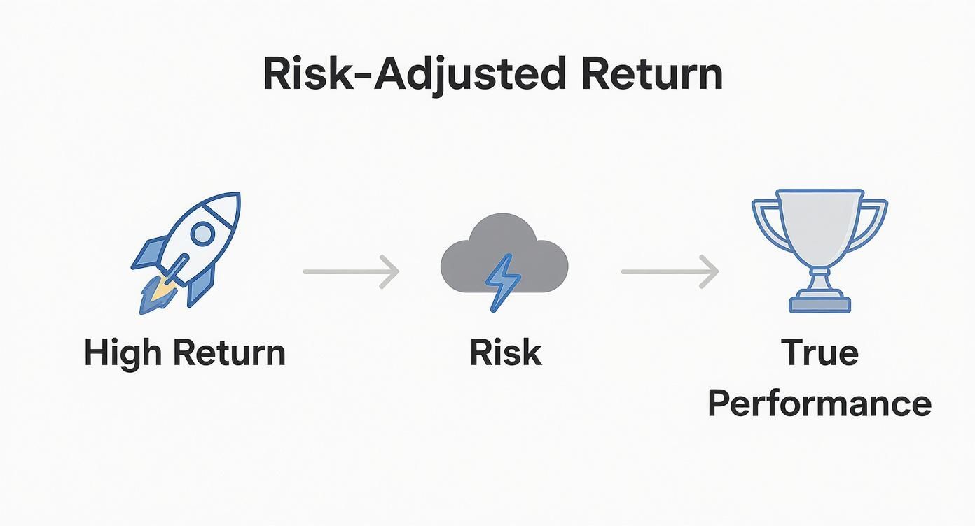
As you can see, a big return is just one piece of the puzzle. It's only after you subtract the risk that you can see if you've truly come out ahead.
The Sharpe Ratio: The All-Purpose Volatility Gauge
The Sharpe Ratio is the most famous of the bunch. You'll see it mentioned everywhere. It measures an investment's return against its total volatility—that means both the exciting price spikes and the gut-wrenching drops.
It’s the go-to tool for evaluating a well-diversified portfolio, like an S&P 500 index fund or your entire mix of stocks and bonds. Because it treats all price movement (good and bad) as risk, it gives you a clean picture of how much you earned for every unit of volatility you had to stomach.
The Sortino Ratio: Focusing on What Really Hurts
The Sortino Ratio is like a smarter, more refined version of the Sharpe. Instead of punishing an investment for all volatility, it zeroes in on harmful, or downside, volatility. This is the only kind of price movement that actually results in a loss.
Why does that distinction matter? Simple. Most of us don't consider a stock suddenly rocketing upward to be "risky." The Sortino Ratio gets that. This makes it perfect for analyzing strategies with lopsided return profiles, where the upside and downside just aren't symmetrical. It's especially useful for options sellers, where the main goal is avoiding those big, unexpected losses.
The Treynor Ratio: Measuring Against the Market
Finally, we have the Treynor Ratio, which looks at risk from a completely different angle. It measures an investment's return relative to its systematic risk—in other words, how much it tends to move in sync with the overall market. This is measured by a factor you might have heard of called "beta."
This tool is best for figuring out how a single stock or asset might behave inside an already diversified portfolio. A high Treynor Ratio suggests an asset is delivering great returns for the amount of market-wide risk it's adding to your plate.
To make things even clearer, let's put these three metrics side-by-side.
Comparing Key Risk Adjusted Return Metrics
This table breaks down the three main metrics, showing what they measure, when to use them, and what their biggest blind spots are.
| Metric | Risk Measured | Best For | Key Limitation |
|---|---|---|---|
| Sharpe Ratio | Total Volatility (up and down) | Evaluating fully diversified portfolios | Penalizes for "good" volatility (upward price spikes) |
| Sortino Ratio | Downside Volatility (harmful moves) | Analyzing options selling and asymmetrical strategies | Can ignore liquidity risk and other non-volatility factors |
| Treynor Ratio | Systematic Risk (Beta) | Assessing a single asset's impact on a portfolio | Useless for assets with a negative or zero beta |
As you can see, there's no single "best" metric. The right choice always comes down to the specific question you're trying to answer about your investment strategy.
How to Calculate Risk-Adjusted Returns in Practice
Theory is one thing, but putting it into action is what really counts. Let's shift from concepts to concrete numbers and see how you can figure out the risk-adjusted return for your own trades. We'll start with a basic portfolio example using the Sharpe Ratio before applying the same thinking to a couple of common options strategies.
The goal here isn't to get bogged down in complex financial modeling. It's about using simple math to make better decisions. Once you walk through these steps, you can start evaluating any investment—whether it’s a stock, an ETF, or an options contract—through a much sharper lens.
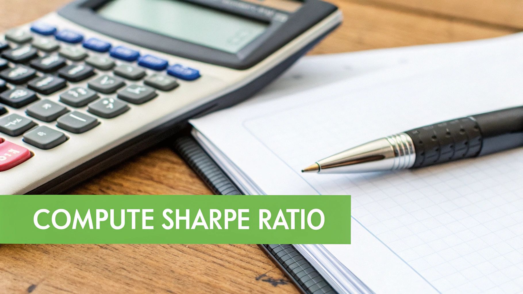
A Simple Sharpe Ratio Example
Let's imagine your portfolio delivered a 12% return last year. Sounds pretty good on its own, right? But to really know, we need to add some context and calculate its Sharpe Ratio.
First, we need two more pieces of the puzzle:
- The Risk-Free Rate: This is what you could earn from a virtually risk-free investment, like a U.S. Treasury bill. For this example, let's say the rate is 3%.
- The Portfolio's Standard Deviation: This number measures your portfolio's volatility—its ups and downs. A higher number means more dramatic price swings. Let's assume your portfolio's standard deviation was 15%.
With these numbers in hand, the calculation is surprisingly straightforward. The Sharpe Ratio formula is simply:
(Portfolio Return – Risk-Free Rate) / Standard Deviation
Let's plug in our values:
(12% - 3%) / 15% = 9% / 15% = 0.6
Your portfolio's Sharpe Ratio is 0.6. This single number now gives you a standardized way to compare your performance against other investments. While this is a traditional portfolio example, getting the hang of how to calculate portfolio returns is a vital first step for any investor.
Applying It to a Covered Call
Now, let's look at an options strategy. Suppose you sell a covered call. Your potential return is the premium you collect upfront. Let's say you receive a $200 premium on a stock position worth $10,000. That gives you a potential return of 2% for the contract's duration ($200 / $10,000).
To figure out the risk-adjusted return, we still need a measure of risk. For a covered call, the main risk is that the underlying stock price drops. So, we can use the stock’s historical standard deviation as a solid proxy for risk. If the stock has a standard deviation of 25%, our calculation starts to look familiar.
Assuming the same 3% annualized risk-free rate, we'd typically need to adjust all our numbers to the same timeframe. But for simplicity's sake, if we annualize our 2% premium to roughly 24%, the Sharpe Ratio would be:
(24% - 3%) / 25% = 21% / 25% = 0.84
Analyzing a Cash-Secured Put
The logic is identical for a cash-secured put. You sell a put, collect a premium, and hope the stock price stays above your strike. The premium is your return, and the stock's volatility is your risk.
- Scenario: You secure a $5,000 position to sell a put and receive a $150 premium.
- Return: Your potential return is 3% ($150 / $5,000).
- Risk: The underlying stock has a standard deviation of 30%.
Again, we need to annualize the numbers to make a fair comparison. A 3% return over a 30-day contract becomes roughly 36% when annualized. The calculation is:
(36% - 3%) / 30% = 33% / 30% = 1.1
In this quick, simplified comparison, the cash-secured put offered a superior risk-adjusted return. These examples show that the process isn't about getting lost in formulas—it's about framing an investment's profit in the context of the risk you had to take to get it.
What a Good Risk-Adjusted Return Looks Like
Calculating a ratio is the easy part. The real skill is knowing what that number actually means for your strategy. A risk-adjusted return metric isn't just a score—it's a tool for comparison, helping you decide between different opportunities with real clarity.
Think of it like a car's fuel efficiency. A raw return is just knowing how far a car traveled. But the risk-adjusted return? That's its miles per gallon. It tells you how efficiently that performance was achieved, letting you make a true apples-to-apples comparison between a conservative ETF and an aggressive options strategy.
Interpreting the Numbers
So, what’s a good number? While there’s no single magic figure, some general guidelines can help you make sense of the results. For metrics like the Sharpe and Sortino ratios, the scale is pretty intuitive:
- Below 1.0 (Fair): The return you’re getting doesn’t quite make up for the risk you're taking on. It’s acceptable, but not great.
- 1.0 to 1.99 (Good): Now we're talking. You're being well-compensated for your risk. A strategy in this range has a strong risk-adjusted performance.
- 2.0 and Above (Excellent): This is the gold standard. It indicates an exceptional return for the amount of risk involved. Investments that consistently hit these numbers are rare finds.
A negative ratio is a huge red flag. It means you would have been better off just holding a risk-free asset, since the investment didn't even beat cash after you account for the risk it took.

The bottom line is simple: a higher ratio means a better what is risk adjusted return profile. It’s a sign of superior performance that didn’t come from just taking on a ton of extra risk.
Making Smarter Choices
Let’s put this into practice. Imagine you're comparing two options strategies you've been running:
- Strategy A (Covered Calls): Generated a 1.05 Sharpe Ratio.
- Strategy B (Cash-Secured Puts): Generated a 0.85 Sharpe Ratio.
At first glance, both might have brought in similar raw returns. But the Sharpe Ratio cuts through the noise. It shows that Strategy A was way more efficient, delivering more "bang for your buck" in terms of risk. That's the kind of insight that lets you put your capital to work more intelligently.
This isn't just theory. Long-term studies show that consistently generating positive risk-adjusted returns is the signature of skilled money management. An extensive analysis of financial portfolios from 1998 to 2020 found that managers delivered annualized alpha—a key measure of risk-adjusted outperformance—between 0.10% and 0.32%. This proves that even modest but consistent risk-adjusted gains are a sign of real success. You can dive deeper into the findings on factor and risk-adjusted return research.
This historical context makes it clear: understanding these metrics is key to building a truly efficient and durable portfolio.
Understanding the Limits of These Metrics
While risk-adjusted return metrics are incredibly useful, they aren't crystal balls. Think of them as a car's rearview mirror: they give you a perfect picture of where you've been but tell you nothing about the road ahead. If you rely on them alone, you're driving blind.
The core issue is that these calculations are built entirely on historical data. And as we all know, past performance is never a guarantee of future results. A strategy that looked brilliant during a calm, steady market could completely fall apart the moment volatility kicks in. The numbers can also swing wildly depending on the time frame you analyze, making a short-term winner look like a long-term dud, and vice-versa.
When Standard Deviation Fails
The biggest blind spot for metrics like the Sharpe Ratio is how they handle unusual return patterns. This is a massive problem for many options strategies.
For example, imagine an options selling strategy that grinds out small, steady gains for eleven months straight. On paper, it looks amazing—low volatility, consistent profits. But in the twelfth month, a single, unexpected market move triggers a catastrophic loss that wipes out every penny of the year's gains. Standard deviation just can't see this coming. It averages out the volatility, masking the true "black swan" risk lurking just beneath the surface.
These metrics are excellent for measuring the efficiency of past returns but can be poor predictors of tail risk—the small probability of a massive, portfolio-defining loss.
This isn't just a theoretical problem; it's a real-world challenge in finance. It's also why you have to understand concepts like the Sequence of Returns Risk Explained Simply. This idea shows how the order in which you get your returns can dramatically change your long-term wealth—a nuance that simple ratios completely miss.
Risk adjustment is also critical when you're comparing apples to oranges, like private funds against the public stock market. A major study looked at over 7,800 global private funds and found their risk exposures (betas) were typically between 0.35 to 0.59 compared to public benchmarks. This proves they carry a moderate but very real level of market risk. It's a clear reminder of why you have to adjust for risk to get a true picture of performance across different investments. You can dive into the full findings on risk-adjusted returns in private assets if you want to see the data for yourself.
Refining Your Strategy with Probability-Based Analytics
While metrics like the Sharpe and Sortino ratios are great for looking in the rear-view mirror, they’re built entirely on what’s already happened. But as an options seller, your most important question is always about what might happen next.
This is where modern, probability-based analytics give you a serious edge.
Instead of just relying on past volatility, these forward-looking tools analyze current market conditions to calculate the statistical chances of future outcomes. This shifts your focus from reviewing old trades to making proactive, data-driven decisions on new ones. For options sellers, that’s everything.
Moving from Historical to Forward-Looking Analysis
Probability analytics don't replace traditional risk-adjusted return metrics; they supercharge them with real-time context. They help you answer the most critical questions you have before putting your capital on the line.
- Probability of Profit (PoP): What are the actual statistical odds that this trade ends up profitable?
- Expected Value (EV): Over the long run, what’s the average amount I can expect to make or lose on this trade, factoring in every possible outcome?
These data points completely change how you size up a trade. Instead of just knowing how efficient you’ve been, you can now judge the statistical soundness of a trade before you ever click the button.
Combining a solid grasp of risk-adjusted return with forward-looking probabilities is how you graduate from just reviewing past performance to actively shaping future outcomes with a real statistical advantage.
This approach is a game-changer when picking strike prices. For instance, you might see a strike offering a juicy premium, but a quick look at an option probability calculator could show it has a 60% chance of being assigned—a risk you might not want to take.
On the other hand, another strike might offer a slightly smaller premium but come with an 85% Probability of Profit. This is the kind of data that lets you fine-tune your strategy, perfectly balancing your hunger for income with your personal risk tolerance on every single trade.
A Few Final Questions
What’s the Difference Between Absolute and Risk-Adjusted Return?
Absolute return is the easy one. It’s just the raw gain or loss on your trade. If your stock went up 10%, that’s its absolute return. Simple.
But a risk-adjusted return asks a much smarter question: "How much of a roller-coaster ride did you take to get that 10%?" It peels back the curtain, giving you a truer sense of an investment's performance and efficiency. It’s about the quality of the return, not just the quantity.
Can a Risk-Adjusted Return Be Negative?
You bet it can. A negative risk-adjusted return usually means your investment performed worse than a "risk-free" asset, like a U.S. Treasury bill.
Think about it this way: you took on risk for a return you could have beaten by doing practically nothing. It's a clear signal that the risk just wasn't worth the reward.
So, Which Risk-Adjusted Metric Is the Best?
There’s no single "best" metric. The right one really depends on what you're trying to figure out about your strategy.
- Sharpe Ratio: This is your all-around workhorse. It’s great for getting a general sense of how a diversified portfolio is performing against its total volatility (both up and down swings).
- Sortino Ratio: This is a specialist. It’s perfect for strategies where you only really care about the bad kind of volatility—the downside. For options sellers, this is often the most insightful metric.
- Treynor Ratio: Think of this one for adding a new player to the team. It’s ideal for seeing how a single new asset might fit into an already diversified portfolio by measuring its return against market risk.
Ready to stop guessing and start making data-driven options trades? Strike Price provides the real-time probability analytics you need to optimize your risk-adjusted returns and trade with confidence. Start your free trial today.